top of page

Visual Effects Artist | Lighter & 3D Modeler
EMMA
SCHABERG
13 March 2023
Week 10 - Harbor Picture Company x SCAD
The end of the quarter has finally arrived which means I will have to wrap up this project this week and present our final iteration to our mentors. Of course, nothing is ever "final"; work can always be revisited and improved. You can always ask yourself what you would do differently if you could start over, what changes you would make if you had 2 more weeks to work on it, the list goes on.
After a long weekend of rendering and compositing, I am extremely proud to call myself a member of team Beluga and show our Harbor mentors the progress we have made. The work I produced in this class was a jump outside of my comfort zone when it came to look development and glass which is especially difficult to master. However, this mentorship opportunity was the perfect chance to take on these challenges and recieve invaluable feedback from industry professionals.
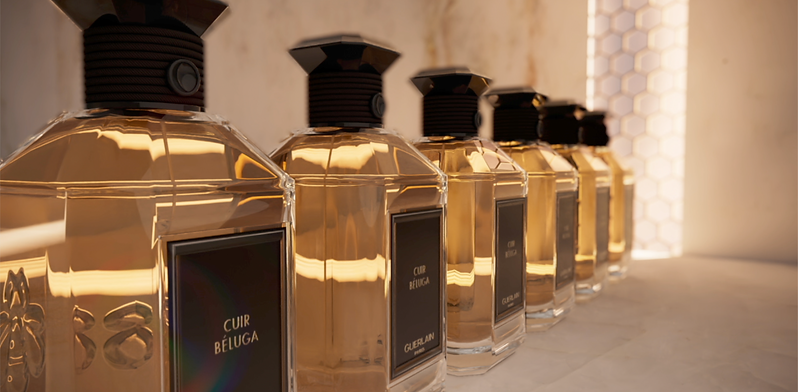
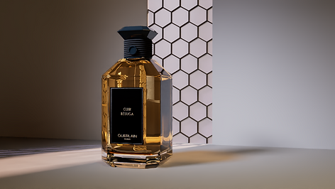
Enough talk- let's reveal my team's commercial for the "Cuir Beluga" perfume by Guerlain Paris for this 10 week mentorship with Harbor!
9 March 2023
Week 9 - Harbor Picture Company x SCAD
Reaching the end of our Harbor mentorship, we have one more week to make edits and apply changes from our mentor's feedback to our commercial in order to have it polished and submitted for week 10. Although it may look like there are a lot of things to change this week, these are all minor adjustments in order to put out the highest quality work we can. I am excited to wrap up this project and share it with my friends and family although part of me never wants to put this project down!
Week 9 Goals
3D
- Increase motion blur of shot 1 (Cloth)
Look-Dev Glass Bottle
- Check material of bottle cap and rope in shot 5 (Pyro)
Compositing
- Use a 2D element such as pyro/mist very subtly
- Warmer toned background in shot 1 (Cloth)
- Decrease contrast of shot 2 (Rack)
- Remove the "On/Off" feeling of the moving light in shot 2 (Rack)
- Warm background very subtly in shot 2 (Rack)
- Thinner moving light in shot 2 (Rack)
- Decrease bloom of window in shot 3 (Spritz) slightly, bring back more detail
- Decrease saturation of gold cap material in shot 3 (Spritz), it felt too artificial
- Use a visible Bokeh Blur for defocus and depth
- Lift background black values in shot 5 (Pyro) for easier transition between the two shots
- Increase darker Vignette in shot 4 (Bee) to help ease the transition of a darker background in shot 5 (Pyro)
Look Development Updates - CLOTH SHADER
After researching techniques to get high quality cloth shaders in Redshift, I ran across a useful resource by MographPlus on Youtube. Their tutorial shows how to use the RS Fresnel with a scalar ramp in order to separate 2 colors based on a fresnel map of the cloth and it's folds. This is especially useful when I am trying to replicate a satin material.

Fresnel
An Rs Scalar Ramp node is used to adjust the fresnel map values and receive different appearances in highlight and shadow of the material.

Here are some screen caps of my Redshift Renderview as I made various versions of the cloth material to compare. Please disregard the noise, this is from screencapping before the render was done.


After a small test of rendering a few frames in the Render Farm to ensure the material would render correctly, I settled with this version of the cloth.

One of our critiques was to add a more visible motion blur to the cloth as is falls. Below is a screen cap of motion blur and deformation checked on and calculating motion blur based on acceleration / velocity.

4 March 2023
Week 8 - Harbor Picture Company x SCAD
Week 8's session in person with our mentors was filled with several exciting notes to help us push ourselves in the final crunch of completing this commercial!
Week 8 Goals
Lighting
- Use Billy's advice, only use an HDR fill Light and 1 Key Light
Look-Dev Glass Bottle
- Remove any diffuse in black materials
- Add emblem displacement
- Get rid of caustic overexposed area on table
- Continue cxleaning up shaders of bottle and cloth
- Make sure all shots use the same shader used in shot 2 for the Cap / Rope material
Compositing
- Bloom / Overexpose the windows even more
- Work on zDefocus, really push the depth in background
Week 9 Progress Video
Look Development Updates - CLOTH SHADER
Below are a few experimental iterations of our cloth shader. The cloth shader is not accurate this week to what we would like to show, so below are reference of a more clear direection.


22 February 2023
Week 7 - Harbor Picture Company x SCAD
Week 7's session with our mentors was filled with lots of notes directed towards look-dev and lighting as we push out new renders of our commercial for the Cuir Beluga perfume! Over the past week, our team has been pushing for a new environment as well as cleaning up our fx. Personally, I really want to use this next week to fix the lighting and look-dev of the shots as well as create a quilt of each shot to ensure each shot feels seamless from one another.
Although I am the team's lighter and modeler, I have not needed to do much modeling for this project. However, this allows me to use my skills as a lighter and be the team's compositer for our shots. This is necessary for our pipeline as we need to dissect our aov's, merge various render layers, apply zDefocus, and color grade in order to get beautiful shots. Over the next few series of blogs, you may see more information on the compositing process that I have come to love doing for our team.
There are many things in store for myself this week in preparation to meet our mentors in person next week when they come to Savannah, but the excitement to show them our work in person is overwhelming!
Week 7 Goals
Lighting
- All window shots need to have same lighting exposure and distance as shot 2
Environment
- Needs objects in scene scale to bottle, Bottle should stay the same space in composition, but the column or ground plane need to change
Look-Dev Glass Bottle
- Try to match color of orange perfume to reference pointed out by Billy, it felt too de-saturated
- Fix colored pixels in shot 3 (Spritz) seen on bottle
- Don't use procedural pattern on gold cap
- Gold material feels dull, make metalness 1 and roughness .1
- Shot 5: white lines appearing on bottom of bottle
- Make sure all shots use the same shader used in shot 2 for the Cap / Rope material
Compositing
- Focus in shot 1 needs work, don't have blurry edges
- Shot 1 defocus needs to increase size (more blurry background)
Week 8 Progress
Lighting and Environment
After going into shot 1 and replacing the lighting with the exact lighting placement and exposure from shot 2, I rendered 2 exr's of the foreground and background to test a slap-comp in nuke. After doing so, I realized I would need control of the diffuse lighting on the floor to ensure I do don't over-expose the ground, but still keep the same lighting values in the window.


In order to have control of the over-exposed lighting on the ground, I separated the aov's to find where the lighting was coming from and re-merged them to create the same render as the beauty pass. All of the aov's I included to render are:
- Diffuse
- Reflection
- Refraction
- Global Illumination
- Emission
- Specular

Before
After
After viewing each shuffle node, I found the source of the overexposure to come from the Diffuse AOV, so I can easily place a grade node below it to control the lighting of that region only. Evident in this case and several others, AOV's are helpful in compositing to avoid going back into 3D to ultimately re-render. Instead, I can save time by directly grading the source of the problem.
Metalness
Metalness 1


Look Development Updates
After changing the lighting of shot 1, I rotated to working in shot 3. Before changing the lighting, I removed the procedural scratches used on the gold and replaced it with a texture map.


With this small change in metalness value of the shader, I noticed an unusual green artifact in the center of the bottle. I will revisit this later to debunk the cause behind the issue. Next, I will connect a texture sourced from the internet into base color to achieve a very light scratch to create a brushed metal effect. I found some references to help direct myself towards a photo realistic texture.
References:


Texture I used:


Funny to mention it, but the problem I mentioned above regarding the green artifact disappears when I connect this texture into the base color! Unintentional-problem resolved!
After changing the lighting of shot 1, I rotated to working in shot 3. Before changing the lighting, I removed the procedural scratches used on the gold and replaced it with a texture map.
23 February 2023
Glass Samples Shot 3
After looking at shot 3, I wanted to go back into the houdini file and play with the glass until I could get it to look cleaner and refined. While comparing our commercial to commercials by Guerlain Paris of the same product, I noticed that there glass bottle had finer edges to reflect light which I felt we lacked in shot 3 facing completely forward. From this perspective, the edges disappear and makes the bottle feel flat. Here is a series of screencaps to show going back and fourth between trace depth samples and affecting the original geometry slightly to see the outer edges of the glass better.
I attempted to make the inner glass shell smaller to see the outer glass thickness, but everything felt too rigid and sharp. I would need to bevel the upper two corners as well.

Going into the model geometry, I beveled a few edge loops. However, I needed to find a middle ground between feeling too flat and feeling too sharp.

I was starting to see more defined edges once I made a few small transforms, but I din't want to see the dip of the sinner shell that you notice below the cap.

After scaling the inner bottle shell, I found that my glass was finally at a stage in the shot where it had dimension and shape. The dip was no longer apparent, and even created somewhat of a fake meniscus!

25 February 2023
Environment Scaling
Some feedback from our mentor Billy Jang was that our environment was lacking scale, meaning the bottle and the window were not relative size to one another. The window was either too small or the glass bottle was too big. Looking into the Houdini file, I checked first to make sure the perfume bottle was to scale in world space using a Tommy node. This is an easy test using a human geo in real world space scale to see how large to scale things such as your environment. My bottle was matching world scale, but the environment was not.
On Thursday, my professors Bridget Gaynor and Deborah Fowler directed that I push back the window in space at about 40 feet, a range where I could scale it large enough to match the scale of a stained glass cathedral window, but still see it in camera. They also directed I change the focal length of the camera from the default 50 to 150-300. I chose 150, which impacted everything from composition to background to camera moves. With the environment change I had to go back weeks progress to fix our lighting, look-dev, camera moves, and composition. This was a lot to place in a single week, but I managed everything on my plate to hopefully cover everything mentioned from Harbor's feedback.
In the screencap below, you will notice the background pushed back in space 40 feet with a human to compare the size of the window. This is includes our new focal length of 150. I was directed by my professors to look at references of cathedral stained glass window altars, which were tall, narrow, and large.

At this stage, I also compared how the houdini redshift "fisheye" lens looked in comparison to the default camera we were using. Although it was interested to see the change, I went back to using the original.

You may notice I added a small table for the bottle to sit on (following Billy Jang's advice of removing the column from last week and making the ground which the bottle sits a table). You will also see a scaled bottle at the windowsill.

With these large environment changes to physical space, I made the window much taller in scale. Below, you will also see a comparison of perspective for the end of shot 1. The left shows seeing further down for me detail of the elevation, while the right has a higher perspective which is more preferable for composition.


26 February 2023
Shot 2 Rack Focus
For the next mentor session, I made two renders of shot 2 (rack focus) with the original focal length and the new focal length. The difference of changing the focal length for this shot drastically changed our composition and the effect it has on the shot (and feedback we've been receiving on it to this point in the mentorship).


15 February 2023
Week 6 - Harbor Picture Company x SCAD
This week, we opted to not present to our mentors while other teams had priority to have their meetings because some of our team members were struggling with sickness. We used this time to catch up on progress and have more to show and receive feedback for week 7. With the mentors comments still in mind from week 5, we are continuing progress towards our Cuir Beluga Commercial.
Week 6 Goals
Lighting
- Priority shot 3
- Shot 3
- lighting and lookdev
- reconsider camera move and composition
- Shot 2
- Speed of light is too fast
- zDefocus needs work, bottle caps were too blurry
Environment
- Bring in Dee's environment assets, start making various compositions
Look-Dev Glass Bottle
- Gold on cap can be rose-gold to fit theme
- Scratches on gold cap, bevel edges
Rack Bottles - Nuke zDefocus Settings
After receiving some feedback from my Visual Effects department chair Gray Marshall, I was directed to go into the zDefocus settings in Nuke to debunk why the focused bottle still had a blurry cap. This was causing the illusion of the focus to feel obviously cg and breaks the realism of it being a camera effect. Below is a screen-cap of how the focus looked before going into nuke and changing the settings of the node.
After going into nuke and looking at every parameter in the zDefocus node, I found that adjusting the depth of field, size, maximum, or focus plane would not solve the issue. However, I found that changing the parameter "math" to "depth" instead of "far=0" changed the appearance of the focus entirely, and removed the blurriness of the caps.

Bottle Cap Adjustments
Because the bottle cap is brought so close to the camera in shot 3 "spritz", I felt I needed to add more realistic detail. Adding procedural "scratches" to the metal gives the appearance that the cap's metal was sanded down and smoothed which shows it's imperfection. However, the realism was still being stunted by the sharp edges of the cap that looked like it could cut. I needed to insert a bevel to adjust the edge smoothness. Although I am implementing these changes into shot 4, I will also make these changes to every other shot's scene as well as the look-dev turntable!

Now to implement a slight beveled edge!

Bottle Glass Adjustments
The cap was feeling more realistic at this point (although I do need to tone down the intensity of the scratches), but Next I wanted to cange the appearance of the glass which was feeling flat and 2-dimensional.

First, I went under the redshift trace depth settings and adjusted the reflection and refraction to see if it could help with the refraction. I also decreased the size of the inner glass shell and liquid in order to see that outer edge of white glass from the bottle.

Secondly, I added a small light inside the bottle to give a glowing effect similar to what we see in shot 5. However, this did not effect the refraction being so dark. Perhaps we need to render separate layers for foreground and background with this shot as well in order to see the bottle with lighting that is closer to the window.

With this in mind, I brought the display and window back closer to the bottle so that it wouldn't refract so much of the darker scene around it. I made sure to turn off the primary visibility of the display under the Redshift object parameters.

Environment Layout
In our last meeting with our mentors, Billy gave us ideas for direction towards an art direction for the environment. This included references from middle eastern windows, a french rococo style elegance, and so on. Dee, our motion media and generalist, has rounded up a few assets for us to use in our environment and hopefully transform into an elegant space with depth and elegance. Goals for this environment is to elevate the product without taking attention away from the product itself.
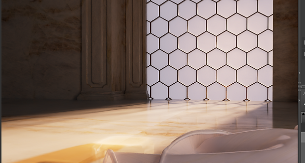
While working on the environment, Dee and I were working together to discuss the art direction of the procedural window. So far, it resembles a beehive pattern to reflect to bee design of the perfume bottle. We were still open to try different patterns and techniques with the help of our professor Deborah Fowler!

I tried many different variations for the window's background to find which would fit the aesthetic and still cast a strong key light onto our product.


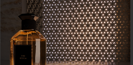

By the end, we settled with using the honeycomb pattern and adding a random seed that would make some of the windows orange. Having some orange in our environment will help bring our orange bottle and environment into the same world and sell it better.


Lookdev Update - Rose gold
Iur Harbor mentor Billy also suggested we change the materials of the cap to rose gold so I included some quick renders below! Our team didn't have time to consider if we should use this version in this week's update composite video, but it is open for discussion in the weeks to come.


8 February 2023
Week 5 - Harbor Picture Company x SCAD
While many things are in store for this week, my biggest focus will be on LIGHTING! It is something I have wanted to jump back into for a while, but had other priorities until this point. Our mentors from Harbor gave very valuable feedback to help push our lighting and environment in the right direction for the week to come. Some of the biggest things to address on my part are listed as goals below!
Week 5 Goals
Lighting
- Priority shots 1 and 3
- Shot 1
- No grey no gold, feels flat
- Window needs to be key light like in shot 2
- Shot 2
- Speed of light is too fast
- Shape of like too boxy
- Shot 3
- lighting too dark
Look-Dev Glass Bottle
- Remove dark refraction completely, still noticeable
- Gold on cap can be rose-gold to fit theme
Find reference for Rococo (french) style window with Dee
Marble Texture for environment
Week 4's Lighting
Using week 4's lighting as a comparison, I am going to show the difference of taking the exact lighting placement from shot 2 and using it in shot 1. Shot 2's lighting was more successful in making the primary light source from the window and creating a broad range of dark and white values, but it was something that shot 1 heavily lacked.


Replacing the display from shot 1, Using same window material as shot 1


Replacing shot 1's lighting with shot 2's lighting
Because the window light was causing an intense overexposed cast on the ground surface, I went back into the light and decreased the intensity.
Then, I decreased the cone size of the spotlight to give a more noticeable light transition. The light is supposed to be coming in from the far right to cast the light into the scene to the left. and having the fake ramp of color gives that flat area more dimension compared to how it looked week 4.


Something I noticed from week 4's composite video was that the glass shader in shot 1 felt different from the look-dev turntable. In shot 1, there was a disconnection from the shell of glass and the orange perfume, it felt as if the glass itself was orange. After looking inside the nodes, I found that the Houdini file had an older version of the bottle connection and needed to be updated to show the most recent accurate version of our glass.

9 February 2023
Look-Dev Turntable Refraction
be An important note I received from our feedback this week was to remove the black refraction that was found when looking at the look-dev turntable. To understand where it was coming from and how to remove it, I went back and fourth between comparing the trace-depth settings and the contribution settings under my keylight. Here is a series of images to show how I removed the black refraction while also getting a nice caustic refraction on the ground!

Light Contribution Samples
Here is a preview of the default samples before I started tweaking them and finding how they affect the bottle!

Light Contribution Samples
After changing the diffuse from 1 to 3, the bottles shadow and contrast slightly changes and feels more illuminated.

Light Contribution Samples
Increasing the single scattering made no visual difference in the scene, but increasing the global illumination increased the intensity too much.

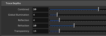
Redshift Trace Depth Samples
In the trace depth settings, I noticed that setting the refraction to a high value of samples not only removes the caustic light hitting the ground surface, but it darkens the perfume overall. It also brings a neon orange in some corners of the bottle which do not feel realistic.

Redshift Trace Depth Samples
After I brought the refraction back down to 13, the neon orange was removed and now the bottle had illuminated bevels.

Redshift Trace Depth Samples
Decreasing the refraction more will start to bring a more noticeable highlight on the ground, but I am not sure if it removes the realism from the bottle itself.

Redshift Trace Depth Samples
Going back into the material of the orange perfume, I adjusted the shader because the settings made the perfume color look lighter and less saturated then before.
Comparison Refraction Before and After
Going back into the material of the orange perfume, I adjusted the shader because the settings made the perfume color look lighter and less saturated then before.


Applying Sampling Changes to Shot 1


Lowering light intensity

Shot 3 Lighting Adjustments
Returning to shot 3, I am applying the sampling changes and going to rework the lighting to where the scene is not too dark.


11 February 2023
When opening the shot 1 cloth file in preparation for a new render, I noticed that there was a new dark reflection or refraction on the bottle. I knew that this could have appeared from adjusting the trace depth settings in redshift. First, I wanted to ensure the dark part I was seeing was either a reflection or refraction. I used a sphere to see if it was a reflection, which you will notice reflect on one of the faces of the bottle.

This face of the bottle is reflecting the sphere and thus the darkened environment display around it. However, the second face's darkness was not completely due to reflection, and I debunked this by going to the redshift object parameters and enabling/disabling the "visible in refractions" box.


Now knowing this, I went into the redshift "out" render node and decreased the refraction trace depth to 6, which completely removed the dark display refraction while still keeping enough information.

12 February 2023
W Shot 1 is a very tricky shot when dealing with glass, refraction, and the dark scene around it. I want to keep the white and dark levels of the background to give dimension into the scene, but the glass refracts the environment the more the display is pushed back into space. However, we need the display pushed back to be more true to scale as well as see more of the environmental modeling changes once we implement them. So, how do I work around this to achieve both goals: glass without dark refraction and an environment with depth and contrast.
My solution was to render the foreground and background in different passes and then comp then together again in Nuke! The background would be rendered as normal with the display back in space, but the bottle and cloth have visibility turned off in the redshift object parameters. In the foreground render, I will turn off primary visibility of the display and only render the bottle and cloth. This way, I can push the display back towards the bottle to remove the dark refraction and even achieve a nice reflection of the window that you wouldn't see if the were rendered together with the window that far in space!


1 February 2023
Week 4 - Harbor Picture Company x SCAD
After our meeting with our Harbor mentors during week 4, I am coming to realize how far we have come since the beginning of the quarter... and how much we still need to work on! Although we would like to put our hands on everything, it's important to take a step back and prioritize which things need the most focus.
Team Beluga met after the meeting and assigned each of ourselves a shot which would highlight our skills. We also listed our priorities for this week so that they would have the most noticeable change by week 5! For myself, I need to focus on look-dev and some camera move adjustments suggested by our mentors. Now that we finally have our perfume bottle model, I need to make the glass look as realistic as possible.
Week 4 Goals
- Look Development: Glass and Perfume Shaders!
- Lengthen shot 4
- Slow Camera move for shot 2 (not static)
Rendering Glass
Redshift Trace Depth Settings
During our recent meeting, I was directed to the dark black refraction of the perfume bottle glass in our previs render. While I want to check my IOR and glass shader settings, first I am going to go into the render settings and adjust the trace depth settings to compare before and after.

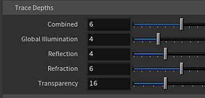
First, I changed the default "Combined" value from 6 to 20. This way, I could adjust more parameters and see a change. I may need to up it more in the future. You can already notice a change in the bottom of the perfume bottles between the image above and below.


Refraction
Next, I started upping the refraction little by little until I noticed there was no more significant improvement. I found 10 to be a good value to end.


Reflection
After adjusting the Refraction, I planned to adjust the reflection in increments until it was high enough to see improvement without upping render time significantly. However, it seemed only going up to 5 made any improvement.


IOR - Index of Refraction
Going back into the RS material, I wanted to see the default IOR and what I could change it to in order to get the most similar glass IOR of the perfume bottle. The default, which is seen in all the images above, is 1.5. After some research, I learned that expensive brand perfume bottles are made from crystal, leaded glass or soda-lime glass. After further research, I found crystal has an IOR of 2.0, so lets visualize that on our bottle!


To visually see the glass easier, I removed the inner orange box to focus only on the glass bottle with an IOR or 1.5, the average IOR of glass, vs 2.0 for crystal.


Comparing these two, I think the crystal glass looks more accurate and removes the black refraction we notice with the 1.5 IOR. I will need to consult with my peers and Professors for more feedback.
2 February 2023
Continuing to work on glass, I first replaced the bottle model with the most updated version by Dee. This new, updated version has thinner glass walls and will give more accurate refractions within the glass. I will also continue working on the glass with only one bottle at a time, since the images above can have odd refractions with bottle after bottle.
Let's compare the two bottle versions to see how the refractions of the glass changes with an IOR of 1.5.


In Redshift Houdini, there is an RS Material and an Rs Standard Material. While they are similar and can both have out color that can be plugged into the redshift_material node, they have different control.
The Rs Material Node has presets for materials you can choose and alter as needed which can be seen as convenient for beginner shaders. An important control that the Rs material node has (which the Rs Standard Material node doesn't) is the choice to change the BRDF between 3 different options. These options include: Beckmann (Cook Torrence), GGX, and Ashikhman-Shirley. First, let's research the difference between Beckmann and GGX!
A great resource I found was https://tryingtobeananimator.wordpress.com/2018/11/25/technical-ggx-vs-beckham-why-and-whats-the-difference/ which gives visual comparisons of the difference between Beckmann and GGX. When it comes down to it, they explain GGX as a more accurate version of BRDF, making it's renders more "realistic". BRDF, or Bidirectional reflectence distribution function, is described as the "relationship the light and view vectors and describes the light response at the shading point based on those two variables." -https://tryingtobeananimator.wordpress.com. Although I have found many sources that tell me which setting to use for which, I found this source to be most valuable. Regarding the Ashikhman-Shirley, I have found it looks very identical to Beckmann, but might up the render-time.
Now, I can understand the setting in the shader and analyze visually which gives the best appearance.

Rs Standard Material

Rs Material
After going into the Rs material node and comparing the different BRDF's, I found that the glass doesn't change visually, and the only small noticeable change is in the drop-off of the light on the ground. Even then, the difference is very slight.
I conclude that the Rs Standard Material is the direction to go after comparing the two images above.


Perfume Shader
After tweaking the glass of the bottle, I wanted to start visualizing the yellow-orange perfume inside the bottle once more. One of our crucial notes from last session was that our current shader of the perfume was too deep and resembled whiskey! After a member of team Beluga, Dee Divakaran, bought a small sample bottle of the Cuir Beluga perfume, its clear how different the perfume looks in real life compared to our current shader.
With the help of Dee Divakaran, we worked on trying to adjust the shader to get the correct color of the bottle in our render. Here is one of the first iterations compared to how it looked last week.
Last Week
This Week - First Iteration


3 February 2023
Something I needed to problem solve was how to remove the black refractions that were noticed in the previs and above. My first solution was to put a large sphere around the scene with a white shader to remove and black space that the bottle was refracting, and thankfully this resolved the issue.


After some more tweaking and referencing our real-life perfume, here is the new update to my look-dev rig. This is just a still to show how the color of the perfume is being tweaked to look less deep and saturated like a whiskey commercial. I also went in and adjusted the dark black values which were too dark before.
Upon rendering this version, I was asking myself what I did wrong to accidentally remove the caustic light we saw in the photos above. After investigating the reason behind this, I soon found out it's because I need the inner layer of the glass inside the bottle with the same texture as the outer layer of the glass. In the render above, I turned it off thinking I didn't need it.

To help with color match and understanding the glass IOR refractions, I constantly am holding the smaller perfume sample next to me as I work! *The camera distorted the color*


From this stage on, some important factors I need to consider with the bottle is the thickness of the base in my reference, how beveled the base is in real life compared to our model / renders, and what I can do to get an inner caustic light hit those internal bevels inside the bottle.

Here is a comparison of before and after going into the maya file and editing the scale of the inner bottle and bevel!


Although our Motion Media designer Dee Divakaran is going to make a texture for the logo, I used a quick png to visualize what it would look like with the logo on!

4 February 2023
After meeting with Dee Divakaran to discuss the new changes to our bottle, she gave me a new version of the bottle .obj where the inside base curved in more to create a better bevel. Here is a comparison of before and after!


As a small break from my other tasks, I dove into shot 5 to attempt switching the bottles out for the new version to see how to would appear in the scene! However, the perfume would appear very dark regardless of turning up the light intensity.

To solve this issue, I turned off all light in the scene and placed an rs environment light to see how the black refraction would respond. As you can see below, a low intensity environment light removed the refraction and brings back that orange-yellow color!

Here is a test render of replacing the bottle in shot 1 and tweaking some of the shaders in the environment! I took the render into nuke to also test the zDefocus.

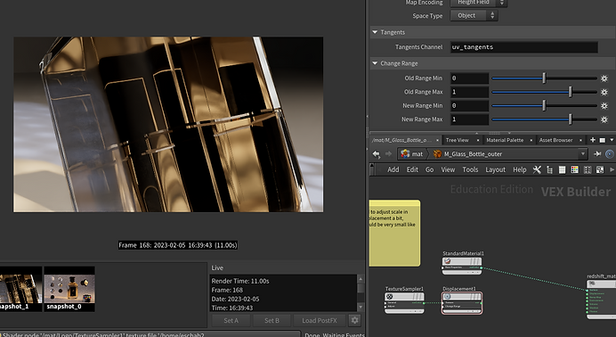
Bee Displacement
After receiving Dee's first version of a displacement map for the bee on the bottle, Dee Divakaran and I were eager to plug it into our shots. However, we both struggled with plugging in the displacement map into the rs material builder. We first put down the texture, added an rs displacement node, and plugged the "out" into the "displacement" of the Redshift material node.

We both struggled to find why our displacement was not appearing. We ensured that we:
- applied uv's to the outer shell of the bottle
- the bee of the displacement map was in the correct spot
- went into the "object parameters" of the bottle and checked ON "tesselation" and "displacement"
First, to visualize that the bee map was accurately placed, I plugged the map into base color.

Since this appeared accurate, I then inverted the image, turned displacement back on, and switched our image from a tif to a png. I also attempted adjusting the displacement scale since it looked too large. Here was our result:

It appears like the bottle is displacing but the bee is staying the same, so my first thought was to use an invert node. However, inverting does not solve the problem. It removes the displacement entirely! We will need to find a way to solve this in the future. For now, here is the displacement set very small at .02

5 February 2023
Continuing where we left off, I wanted to problem solve why I was seeing this line in the bottle.

First, I disconnected the displacement to see if that's where it came from (since this only became an issue after I started working on the displacement). Unfortunately, the line was still appearing.
Next, I went into the object parameters of the bottle and turned off "tessellation". this removed the line I was noticing!

After talking to team Beluga member Galina Bovykina, she directed me to blur the displacement map of the bee to get a smoother fall off then the straight lines we were noticing. Here was the result of connecting a blurred displacement map!

Shot 5 Lighting Update
Once I opened shot 5 to update our new bottle, I needed to go back into the lighting to remove the black refractions I was noticing. I had to restart all the lighting and placement, but the first variation was exciting to see!

The image above felt very flat and reminded me of a look-dev rig, so I seeked a different direction in what we could do for the shot. Here is a reference that would be a nice inspiration for this shot's lighting / background!

Using this as inspiration, I first deleted the backdrop to see what the bottle looked like against a dark void.

However, I would want to see the reflection of light on the ground, so I brought back the backdrop and turned the shader's weight to a very dark grey!

Look Development Rig
Here is a rendered turn table of our Cuir Beluga Perfume bottle for week 4!
18 January 2023
Week 3 - Harbor Picture Company x SCAD
Rolling into week 3 of the quarter, team Beluga is excited to use the feedback from our mentors to proceed in the pipeline. This week, one of our biggest notes from the mentors surrounded the camera movements in our animatic. Some of the notes mentioned were:
- the camera moves felt too mechanical
- the shot compositions needed more variety of different camera moves
- there should be more up-close shots
- shot 4 should have the camera move one way while the lights move in the opposite direction to produce a lens flare
Week 3 Goals
- Previs!
- Take reference photos / videos from real like to study composition and camera motion
- Edit camera movements to feel less mechanical, have a better flow
- Study length of shots and how they feel together in speed
- Work on lookdev rig
Perfume Reference for Previs
In class on Thursday, Professor Gaynor directed us to go outside with a perfume bottle and start taking videos of our shots to study how our camera would move and how we would fill the composition of our shots.
Here is a library of some of the several shots we took to figure out as a team what camera motion would look best. In some videos, we tried to emulate the lighting as well.


With this reference, I went back into our animatic on Thursday and began re-working to camera moves in each shot. On Friday, I met with Dee Divakaran to collaborate on reworking the cameras and composition.
After examining this previs, we noticed that shot 1 was moving very quickly and not giving enough time to build up to the reveal of the product. You may also notice the ease-in and ease-out of the camera motion, which is very telling that it is cg keyed animation. In fact, we noticed all of our shots up to this point had the same ease-in and out. This makes the previs feel very disconnected like it's pausing before going to the next shot. How did we rework this on Saturday?
First Version
First Version
First Version
First Version
First Version
Second Version
Second Version
Second Version
Second Version
Second Version
While some shots remained similar between the two iterations of previs through two separate days, some shots were reworked on timing and flow. Small adjustments like cutting a shot while the camera is still in motion have made big improvements.
Lookdev Update
Because I have made small adjustments in my lighting, I wanted to implement it into a lookdev rig for our next session. I used the lighting from shot 4 because of the moving lights in the scene. I rendered a lookdev turntable and a lookdev with both the turntable and moving lights. Unfortunately, I did not know that you shouldn't render a lookdev rig with both moving lights and a turntable. I will still include both versions here on my blog!
These materials are very preliminary and do not represent our final product. This week, I will dive into look dev and create materials that match the product. For instance, the black values of the bottle are very intense and not realistic. The glass will also need some help in the next week ahead!
Session 4 Presentation
18 January 2023
Week 2 - Harbor Picture Company x SCAD
After our meeting on Tuesday where we pitched our project to our mentors, we got the green light to proceed with our idea and start R&D. This week, my goals are as follows:
Week 2 Goals
- Model perfume display
- Begin preliminary lighting for shots 1-3
- REFERENCES
- First iteration camera animations
- Decide naming convention and prepare a dropbox folder with team members to share files
Modeling the Perfume Display Environment
Because I knew I wanted the display to be made procedural with parameters that could easily be adjusted at the geo level, I modeled the first iteration of the environment in Houdini. Although the set up is simple, finding the best method to constructing the "beehive" grid behind the perfume was proving to be a challenge.
In order to make it so that I could always adjust the beehive size and proximity, I used grid and points from volumes nodes in the configuration of a tetrahedral which was copied to points with a circle node.


The following parameters are used for quick changes in appearance for a cleaner work flow and easier hand offs in case another member of my group takes the file from me.
Quick shaders were made using RS material builder which would help when I continue in my next stage of preliminary lighting. Following one of our strongest references, I wanted to use a slightly emissive beehive window behind the product which would cast unique shadows.
Next, I began lighting the scene. I definitely made the mistake of lighting too saturated and vibrant at first, but it helped me decide a color palette that would compliment the perfume. Below is a series of screenshots from my Redshift render view of my iterations and progress in coming to a more elegant feeling. I found that "less is more" was the correct approach.


The latest update is closer to delivering the mood of the commercial, but there is still a long ways to go.

22 January 2023
Over the weekend, all the members of team Beluga met at the mall with a specific goal in mind: REFERENCES!!! We searched through department stores to find our specific perfume "Cuir Beluga". However, there was no success in even finding any perfume by Guerlain Paris. Thus, we decided to still get references for things such as:
- Perfume bottles and how the glass looks next to different lighting
- Moving liquid inside the bottle for our fx flip tank of "swooshing" perfume
- "Spritzing" the perfume
References Taken by Team Beluga


Lighting Update
With an early version of the perfume model shared with me, I brought it into my Houdini file in order to start animating the camera and thinking about composition. Meanwhile, I also took this opportunity to consider how the lighting will look, and made some new test renders.
Below is an animatic that shows the first version of the camera moves.
Below are some of the more recent adjustments I made to the lighting. I changed the spotlights to RS lights which made the shadow softer and dissipated as it went further away from the source of its casting object.


WEEK 1
13 January 2023
Week 1 - Harbor Picture Company x SCAD
Welcome readers! In this series of blog posts, I will be documenting my process throughout the next 10 weeks to show my work throughout my collaboration course at SCAD with Harbor Picture Company!
For first-time viewers, my name is Emma Schaberg and I am currently in my Junior year at the Savannah College of Art and Design pursuing my BFA in Visual Effects. In this collaborative course, the class is separated into several smaller groups of 3-4 people who will work as a team to create a commercial. I was assigned to team "Beluga", named after the perfume product we chose to advertise for our commercial!
Team Beluga comprises 4 people: Thalia Valencia-Murphy, Dee Divakaran, Galina Bovykina, and myself. Half of our team comprises fx artists while the other half is made of lighting / look dev artists (such as myself!).
For this commercial, we have decided to create a commercial advertising "Cuir Beluga" perfume by Guerlain Paris.
Roles & Responsibilities
Click the link to view each team member's personal process blog!
Concept
Create an elegant commercial based on the Cuir Béluga by Guerlain that accurately represents the brand and product. The effects and lighting that are used are meant to display and enhance the different qualities of the perfume.
Elements:
-
High contrast lighting to shift focus onto bottle
-
Reveal of bottle by silk sheet
-
Swooshing of perfume liquid
-
Spritz of perfume in action
-
Pyro to emulate smell and transition to product name at the end
Concept art drawn by myself

Reference Lighting
After collecting several lighting references for our concept, this directed me to narrow down which techniques would flow best with our product and theme of luxury. A trend we noticed in several commercials was a dim-like brightening in some manner in the opening shot. This gave us the idea of having a distant light come closer to our perfume for shot 1 to reveal our product and bring it to life slowly.
A light source coming from behind our object will cast beautiful beams of light onto the perfume like a halo with the help of a slight atmosphere. Using some pattern (like a beehive pattern) will cast unique shadows onto the surface the product sits on.
The lighting will lean more toward a warm temperature following our intended color palette of ambers, golds, blacks, and whites.


Commercial References
Team Beluga Pitch
bottom of page